Sadie Barnette's "Inheritance" at Jessica Silverman Gallery

Bay Area artist, Sadie Barnette, opened her first solo show, “Inheritance” at Jessica Silverman Gallery back in February of this past year (2022). I am enamored by the way Sadie can translate ideas across so many disciplines and processes - installation, photography, wallpaper, drawing, sculpture, and yes, Neon.
The mix of materials and messages build a layered, textured and complicated story of identity and inheritance influenced by family, history and politics. “Inheritance” is a tribute to kin, an exploration of identity and, what Sadie calls, “generational inheritance”. In her interview with the San Francisco Chronicle she explains,

“I was thinking of inheritance both as you inherit wealth or family jewels, and so much of this history is jewel-like to me and precious. But also thinking about the inheritance of trauma or what planet we’re leaving for people to inherit, thinking of the interconnectedness of the good and challenges that are passed down from generation to generation and taking care of that inheritance.”
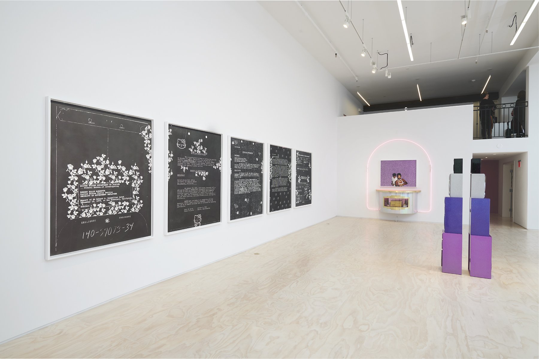
A color story - pinks, purples and blacks” - permeates the work creating both harmonies and contrasts. There is a hardness and a softness in the works. Intricate typography is featured as wallpaper and large graphite drawings, the cursive tails of the typefaces turned into crisp geometric patterns. Sadie’s graphite “FBI Drawings” are dotted with doodles of flowers and Hello Kitty that subvert the oppressive investigative eye of the FBI on her father. An installation of a domestic space is grounded by bold, black geometric text, a fully stuffed couch upholstered in glitzy iridescent fabrics that matches her color scheme.


sADie: I love that you see hardness and softness because there's always supposed to be recognition of one thing by also including its opposite. The big pieces feel bigger when there are also small pieces and the dark pieces feel darker when there is also brightness. There is the violence of the surveillance and repression up against the beauty and warmth of family. I like pinks that feel synthetic, electric, hot, I use blues of California skies, and the holographic vinyl feels extraterrestrial.
The sinuous typographical drawings, rendered in graphite, are similar to the objects we make in glass. They remind me of the flow and continuity of our own pattern making process. Type and font is definitely in our wheelhouse and Sadie makes mastery of her renditions, using the bends and curves to form continuous contours and patterns. These works add a texture to the paradigm through layering and repetition as well as through our own imagining of her painstaking exercise. Hyper-focused, repetitive and exacting is a flow and meditation that Neon benders can relate to, I’m sure.
The idea and image of family and inheritance is examined throughout the exhibition in many ways through many mediums. The word “sister” is repeated in a hand drawn geometric pattern that serves as the wallpaper for an installation of a domestic living space. Through sculpture, photography and painstaking graphite drawings, we are introduced to her father, Rodney Ellis Barnette - founder of the Black Panther Party of the Compton, California chapter and proprietor of the first black-owned gay bar in San Francisco, The Eagle Creek Saloon.

2019 at The Lab, San Francisco
sADIE: In 1990, my father, Rodney Barnette, opened the New Eagle Creek Saloon to serve a multiracial gay community marginalized by the racist profiling practices of San Francisco’s queer bar scene at the time. In 2019, San Francisco's The Lab commissioned my project of recreating his bar as an art installation that is a monument, an altar, a stage, and a party. I've continued telling the story of his bar and creating an archive through objects. This new neon is the latest in the series.”
The design is not a replica of a sign that ever existed, but rather an imagining of a logo that Sadie says, “feels fresh for today”. Her friend, Oakland native Dominic "Treat u Nice" designed the logo and Sadie envisioned it in Neon. The piece was fabricated by Shawna Peterson of Peterson Neon in Northern California, and an exhibiting She Bends artist. Shawna has been bending neon for many decades and is largely considered one of the best benders of her generation, having created and maintained numerous noteworthy signs in the Bay Area as well as being the go-to for fine art fabrication displayed in blue chip art spaces.

2022, Jessica Silverman gallery. Courtesy of the artist
sadie: I've wanted to work with Shawna for years and the show at Jessica Silverman was the perfect opportunity for supporting this dream. Shawna did her thing and I was blown away.
Shawna: I actually really enjoy helping other artist's complete their visions. I think it is a bit unrealistic to expect that an artist should learn neon tube bending if they decide to use neon as an element of their work alongside other media. I can assist them in fabricating what they design and create. Work for artists is definitely more creative and often more challenging than sign work. Sometimes it is more work advising the artist about how to use neon if they don't have experience with it. But, because it is more creative, it is more interesting even if it is more time consuming. The other aspect is that artists are also more involved in the whole process- especially during the pattern making stage.
When asked about some of the the technical aspects of the work and the lifespan of the work outside the gallery, Shawna describes the commission:
“She had a design that was complete and I just had to make it neon friendly. What I mean is that the font she chose was a "bubble gum" style font that I had to double stroke - something very common with a lot of letter styles and neon. ‘eagle Creek’ was about 6 units and the arch was 3. It took about 3- 4 days of bending and pumping. One whole day was pumping everything. The pattern work took half a day because of the large format of the arch. I am on call or "for hire" if the piece gets sold or moves to a local gallery. I know that the work has moved on to New York already so I don't know who they hired for the install there. I provide the install patterns and assume they take photos of the wiring, etc. On more recent projects I have been asked (for pay) to create a re-install guide for works (like for Andrea Bowers.) I also often get hired to de-install, although not always.”

The sign is a combination of 12mm and 15mm blue “pumped red”, which means that it was filled with Neon gas. This combination of a phosphor coated glass and gas color emittance creates a bright bubble-gummy pink. The font that Sadie’s friend chose, apparently also called “bubble gum”, would be transferred to a to-scale bending pattern that Shawna would create. Because of the font style - one with a varying thickness - it was created in a double stroke design to capture the undulation of the lettering.
Described as a “high femme aesthetic”, her choice of colors, font and material are used to “escape a binary vision of gender and sexuality while celebrating the extant legacy and ongoing resistance of the Black radical tradition.”
SADIE: To me, this "high-femme aesthetic" is about a language and multitude of styles that certainly exist beyond the binary of gender and are about shine, and over-the-top presentation, turning up the volume on luxe, glamour, glitter and bling...these visual ways that people tell the world who they are and find their community.
I pause for a moment at this proposed aesthetic concept and think about its presence in our medium, specifically. I would like to offer a few questions for consideration. Is Neon by its very nature - glitzy, bright, buzzing and attention-grabbing - high-femme? What I can certainly appreciate about this descriptor for a Neon work is that it severs it from its usual associations with industry and capitalism, both patriarchal and binary in their implications. At the very least, to be high-femme is to be in resistance with these concepts, surely? To be made of glass, a material that is perceived by its craftspeople to be fluid in its changing states, is certainly remarkable. As an aside, I enjoy considering it a sub-genre within our sculptural medium and appreciate Sadie for illuminating it (no pun intended).
Sadie’s tribute to her late father’s bar is a beacon of both the past and the future, nostalgic and new. The use of Neon to reimagine Black and Queer histories is necessary. Sadie’s bright pink light, made of cosmic light and glass, imbues black and queer joy, its legacy, perseverance and permanence.
I asked Sadie what Neon works have been inspirations close to her heart.
One that will always be close to my heart is Glenn Ligon's "Give Us a Poem," 2007 because it greeted me everyday while I was an artist-in-residence at Studio Museum in Harlem.
A mentor of mine once said (heavily paraphrased) - There’s something really special that happens when an artist employs the skilled tradesperson as an arm in the creation of their ideas. There is a fresh optimism and big imagination for the artist who hasn’t been trained around the material's physical and industrial norms and restrictions. They are able to imagine the impossible and can will objects and events into being that otherwise would not have happened.
Artists and designers bring something of themselves to a material - a personal or cultural narrative, a symbol, a boundary to break, a lived experience. At this intersection of conceptual design and skilled trade, artists impart their theories on physical matter and expand upon its language - a language we collectively, knowingly or unknowingly, use in our own works in a layered conversation. I imagine this interaction as an ongoing exchange of energies, something cosmic and galactic - seemingly still objects actually buzzing, tangibly and philosophically, a boundless energetic dialogue.
Along with historical signage and its preservation, the creation of conceptual artworks in Neon by both the bender community and those outside the clique contribute to the legacy of our beloved and scintillating medium. Fine artworks in Neon imagined by an abundance of diverse minds and narratives contribute critical conversations vital to Neon’s lineage that are inextricably linked to the work inside our own studios. Creating space to honor and analyze these works makes us better Neon historians and artists.